Color selection should be considered when creating a document. When text is hard to read, individuals often bypass sections of a document or simply become unable to understand the document.
A general rule of thumb: If it’s hard to read for the person writing it, then it’s hard to read for the person reading it.
Color contrast standards
Under the Web Content Accessibility Guidelines 2.0, Level AA, which apply to the web documents, there are two color ratios to know:
- A ratio of 4.5 to 1 for normal sized text, sized at less than 14 points. This rule also is applicable to text that is less than 18 points and has no bold style applied.
- A ratio of 3 to 1 for large-sized text, sized at 18 points for more. Text that is 14 points and bolded is also considered to be large sized with the 3:1 ratio being applicable.
For example, text that is red on blue has a contrast ratio of 1.5:1, and would not be viewable to many people. Adjusting it to yellow on blue instead holds a ratio of 5.8:1 and is viewable to most people.
Color Contrast Within Canvas
Checking for color contrast or as Canvas calls it text contrast within Canvas can be done within Canvas either using the Accessibility Checker in the rich content editor or by using UDOIT.
Canvas Accessibility Checker
For text contrast, the Accessibility Checker verifies color using the same calculations as the WebAIM tool and verifies against Theme Editor templates without High Contrast Styles. However, High Contrast Styles must be enabled for verification if a link color is overwritten manually in the Rich Content Editor.
Using the Accessibility Checker in canvas may prompt you to correct color contrast. It will present you with two sliders so you may select new higher contrast colors for your text.
Open Accessibility Checker

At any visual text box editor in Canvas, click the Accessibility Checker icon.
Note: Depending on the width of your browser window, you may have to scroll the menu bar horizontally to view the icon.
Accessibility Checker
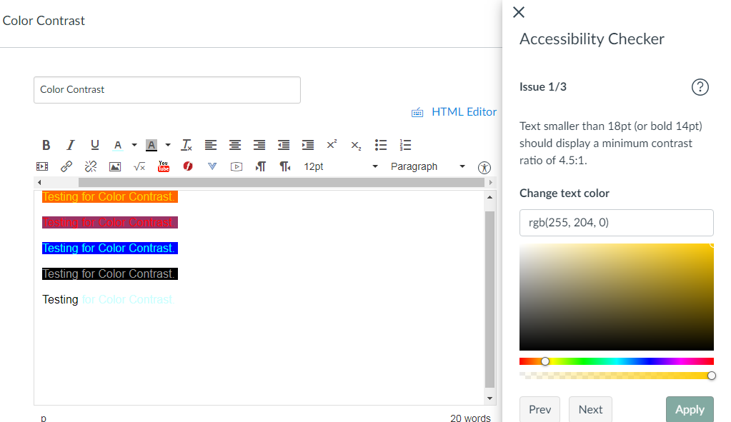 Text smaller than 18pt (or bold 14pt) should display a minimum contrast ratio of 4.5:1.